HENK Visits with Gisele Azad
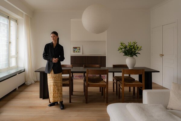
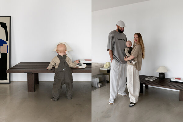
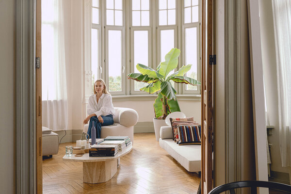
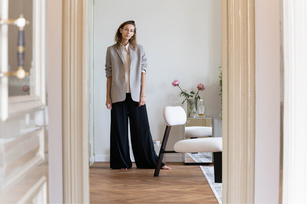
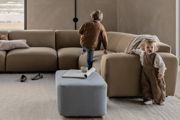
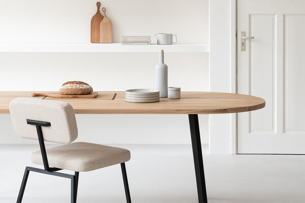
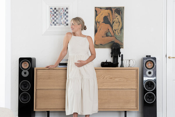
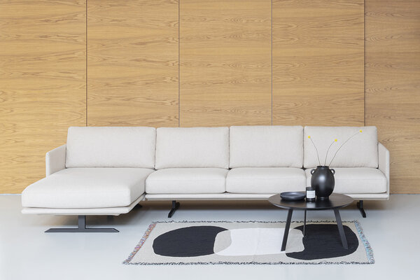
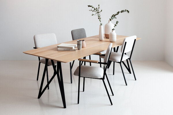
In the series ‘HENK Visits’, we stop by the homes of inspiring individuals to give you a peek into their daily lives. This time, we visit Gisele Azad, a creative consultant and columnist for Vogue.nl.

In the series ‘HENK Visits’, we stop by the homes of inspiring individuals to give you a peek into their daily lives. This time, we visit Gisele Azad, a creative consultant and columnist for Vogue.nl.